The busy indie author’s guide to sci-fi and fantasy book covers
I create book covers for a living, and the number of self-published or indie authors I meet who unknowingly sabotage their success by not knowing what they really need when they get a book cover is staggering. Read on to learn how to get a cover that won’t leave you regretting your purchase.
By the end of this article, you will learn:
- the two types of indie authors (and which group you belong to)
- what all successful book covers must do to sell books
- what are the three most important characteristics of a book cover that sells books


What successful book covers must do
This answer really depends on your goal as an author, and in my experience, there are two notably different groups that the authors I meet fall into:
- Authors who write purely for fun and don’t care that much about selling books
- Authors who love writing, but treat it as a business and want to sell books
Both groups may enjoy the creative fulfillment of writing the book, but the first group often prioritizes the cover matching their book and meeting a particular aesthetic they like, while the second group prioritizes how well the cover will sell the book.
When I design book covers, which group an author falls into is one of the first questions we have to answer. Without knowing this, we don’t know what our real goal is, and I can’t guarantee you get a book cover that does what you want.
Selling books doesn’t matter to you
Good news. Your job just got a lot easier!
If you just want to enjoy writing stories and sharing them with a few people, then at a bare minimum your cover really just needs to match the guidelines of your distributor.
For e-book covers, that usually means having an aspect ratio of 6 x 9 (1800 x 2700 px is a good size) that you can upload to amazon or whichever online retailer you want to use. For paperbacks, you’ll need to also include a spine and a back cover, and be sure the pdf is created at 300 dpi so that when it’s printed, it won’t look fuzzy.
That said, in my experience, most authors who belong to this group want more than the bare minimum. They also want a cover with beautiful art that they personally like and feel matches the story. In this case, the designer’s job is simple: create art the author likes based on what the author wants.
You want everything on the cover to match a scene in your novel? No problem. You want stylized humorous painting for your horror thriller or lots of skin showing on your chaste high fantasy? I’ll give it to you. Want lots of sci-fi tech on your high fantasy? You’re the boss.
Why?
Because it doesn’t matter whether the cover sells your book. That’s not your goal when you belong in this group. For authors in this group, the cover is about what you want as an author, and my job is entirely about giving you that, regardless of what that might mean for your sales.
There is no shame in being in this group. Writing can be an enormously fulfilling creative endeavor in and of itself. We don’t have to monetize the things we love. That’s a choice each person makes and I admire authors who have done the inner work to determine what it is they really want to get out of their writing and have the fortitude to acknowledge that.
You’re here to sell all the books
Just as there’s no shame in not caring whether your book sells, there’s no shame in earning money from your writing. If you’re in this group, you may adore writing, but at the end of the day, you understand that if you want to earn an income from your writing, the cover can’t just be pretty art that matches an image in your mind from your story.
You’re here to sell, so this cover is not about you and what you want. It’s about your reader and what they want. And not even just any reader of yours. This cover is specifically about the reader who doesn’t already know you write what they love. (After all, the readers who already love you will buy your next book regardless of the cover.)
If you belong to this group, you understand that covers are marketing shorthand for genre, book tone, and the overall type of story a reader will find within a book’s pages. And if you want to make a career out of writing stories, your job is to find a designer who can create a cover that successfully coaxes the right readers (those that would like your book) into clicking on it and reading the blurb, all without accidentally catching the eye of the wrong readers (those looking for a different type of story).
It’s a bit like fishing.
For example, a good cover designer knows how to bait the hook to appeal to exactly those readers who like lighthearted high fantasy with female lead characters and an important romantic subplot.
Like high fantasy, but hate romantic subplots? This cover won’t appeal to you. Want all the angst in your high fantasy? Nope, still not for you.
Could that designer create a cover that would appeal to people who live for the angst or people who hate romantic subplots? Sure, but that’s not the point.
For a successful writing career, you don’t want to catch all the fish in the sea. Just the ones who want what you’re creating.
This is especially obvious when you imagine that all those extra fish that you caught but didn’t mean to may go on to leave you 1 star reviews because they thought the book they were buying would be angsty and it wasn’t or there was too much romance in their high fantasy.
A lot of authors don’t realize that marketing is all about narrowing. Narrowing in on exactly those readers you want to appeal to. Does your book mix genres or have wider appeal? Great. That’s not uncommon with the books I’ve designed covers for, but you still have to narrow it down.
Maybe you write historical fantasy and you’re trying to decide whether to emphasize the fantasy or the history? Lots of fantasy readers like some history in their stories. Far fewer historical fiction readers like some fantasy in theirs. You market to the fantasy readers.
Each author has to go through this process to identify exactly which audience they want to target (and who they want to be sure not to appeal to). Know this info when you hire your designer, and your cover will be much more successful.
What are the three most important characteristics of a good book cover that will sell your book?
This one is easy to answer, and hard to implement. In my experience, the most important characteristics of a book cover that will sell are:
- (Sub)genre-matching
- Professional typography
- A marketable thumbnail
Why?
Because for a reader, reading is all about hacking your emotions. You want to feel the giddiness of love? You reach for a romance. The awe and wonder of worlds unlike ours? Now you’re in the realm of fantasy or sci-fi.
So if you want a book cover that sells your book, you first have to understand what it is your readers get from your book. And then, you make sure your book cover feels like that.
Genre-matching
Once you know who you want your cover to target (e.g. readers looking for high fantasy, humor, and romantic subplots because they want to feel wonder, giddiness, and light-hearted), then we can get down to work.
Covers are an unwritten language where certain images, elements, colors, fonts, font styles, compositions, and more all work together to send a cohesive message about the kind of book this is. One that matches what the readers of this type of book have subconsciously internalized from purchasing and reading dozens of other books like the one you’re trying to market.
Now, like all languages, these elements change over time, but a good designer knows how to not only read the language (i.e. recognize these subtle differences in genre, tone, etc.), but speak it fluently (i.e. create them!). And they keep up with the changes.
What may have been common 10 years ago, may be rare now. Or perhaps the trend that everyone’s been hopping on is actually already on its way out. Designers know this stuff like it’s their job because… well, it is
Ok, that’s all well and good, Jenny, but how do authors make sure their covers showcase what their readers want?
Good question.
Match subgenre, heat level, and tone.
Book (sub)genre
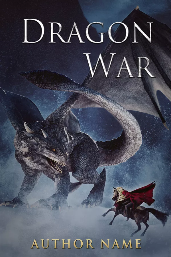
Writing an epic dragon fantasy that takes place on a magical world? Show us the magic, the castles, the tall mountains, and most importantly, the dragons!
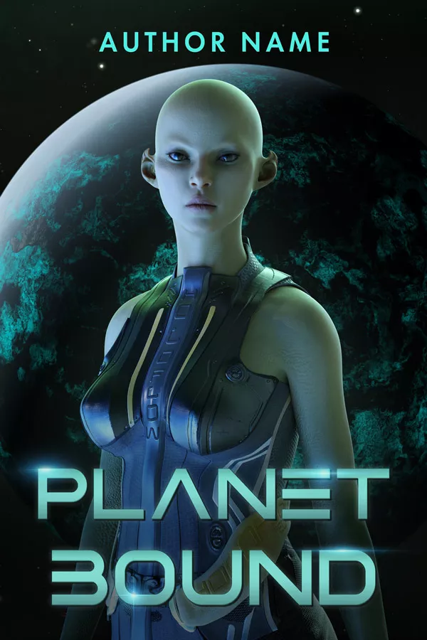
Space opera? Gives us those spaceships and alien worlds.
Steamy paranormal romance? Sensuous women and hot guys with lots of skin and magic-y effects.
You want the (sub)genre to be obvious at a glance. And including the right images on the cover can go a long way toward establishing the subgenre. That includes the obvious elements like castles or city skylines, magic and supernatural creatures, but also the more subtle elements like ornate borders, specific styles of typography, certain colors or even compositional elements (e.g. the size of the character on the cover).
Now when I say genre-matching, a lot of authors assume I just mean things like urban fantasy or space opera. And I do mean those. But I also mean so much more than the few categories of books we happen to have convenient labels for.
These are all sci-fi book covers, but they target notably different sci-fi readers.


And these are all fantasy book covers, but the subgenres are completely different.
Remember, marketing is about narrowing.
What kind of urban fantasy do you write? Is there an important romantic subplot or is romance not important? Is it humorous or very very dark? Female main character or male main character?
These matter.
So your cover needs to make this clear.
Otherwise, your humorous urban fantasy with a female main character and an important romantic subplot may get lots of hate from readers who wanted dark and gritty urban fantasy with a male main character and minimal to no romance.
And that doesn’t even get into how close some genres can be to each other. Market your humorous UF (urban fantasy) with a romantic subplot as a steamy paranormal romance and even though readers were looking for romance with a female main character and supernatural creatures in an urban landscape (which you provided!), you’re still going to get a lot of unhappy readers.
And you miss a lot of readers who would adore what you created!
So while yes, the cover needs to match the umbrella (sub)genre, it’s equally important that it also convey important aspects like tone and heat level.
Book heat level
This one’s pretty self-explanatory.
Are you writing a steamy paranormal romance? You need to show some skin. Chaste romantic fantasy? Keep everything covered. Mix these up and you get a lot of unhappy readers and the reviews will reflect that, even when you’ve written an incredible book that nails what readers of your genre want.
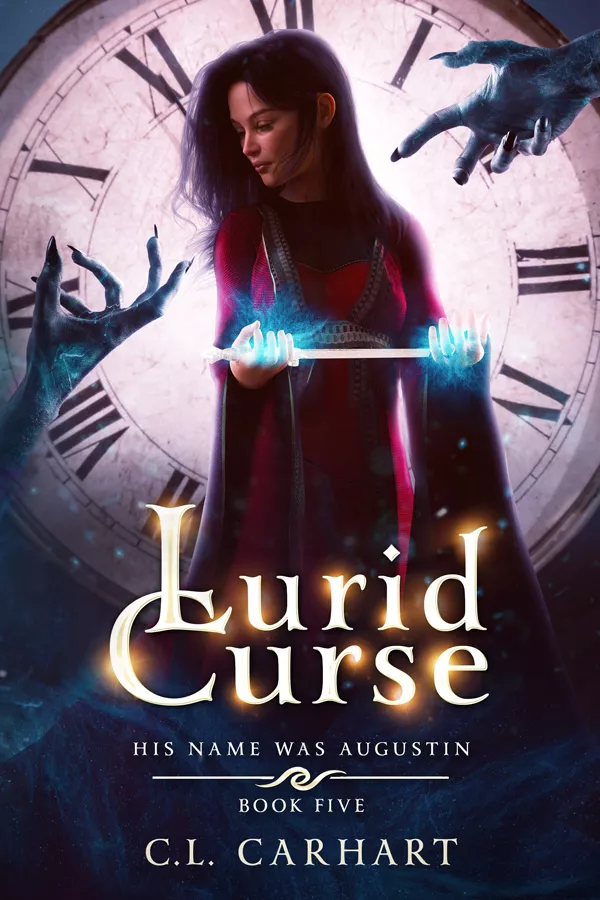
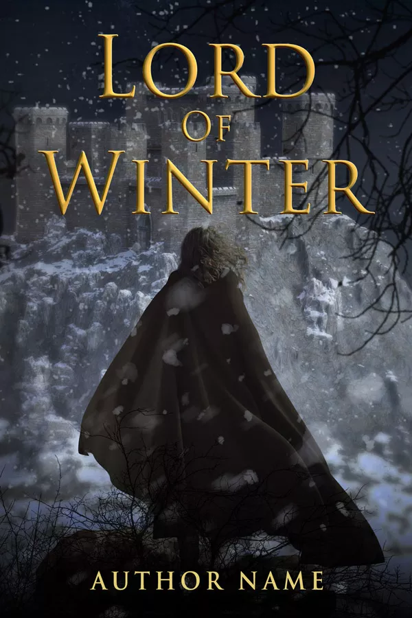
At a single glance, you know that Lord of Winter and Captured by the Alien Fire Lord will treat sex and romance in notably different ways. Make sure your covers showcase the right level of heat for your book.

Book tone
Light and happy, bring on those saturated colors. Dark and grim, you’re probably looking at tone-down more desaturated hues.
Is the tone wistful and melancholy? Then you’ll probably want to avoid the fiery reds and sensuous purples that are common for paranormal romance.
There’s a whole language to color schemes. Multiple languages really when you remember that some colors have different associations for different cultures. And not all colors go equally well together.
But if you look at the cover and immediately feel “anger” when you’re writing a sweet romance. Or the cover screams lonely and wistful, but the book is horror. Or satire. Well, that’s obviously not the tone you want to convey.
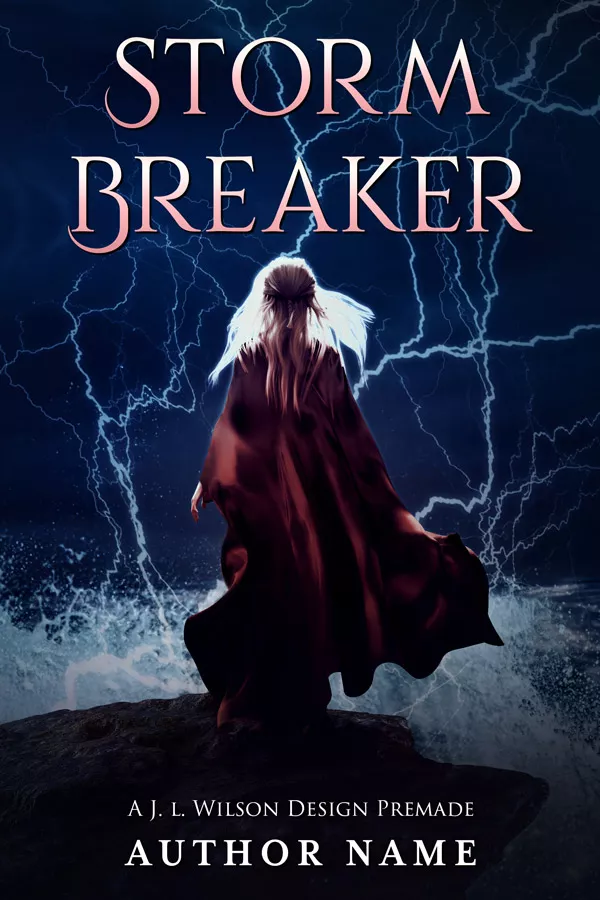
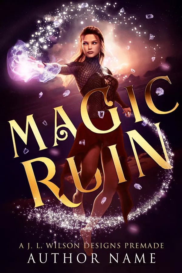
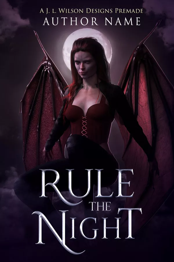
Just compare the three fantasy book covers below. Even though they each contain fantasy creatures (mermaids, dragons, and vampires), each has a distinct tone. Fathoms below is more wistful and serious. The Isle of Dragons is more light-hearted wonder. And Blood Heir is more edgy and sensuous.

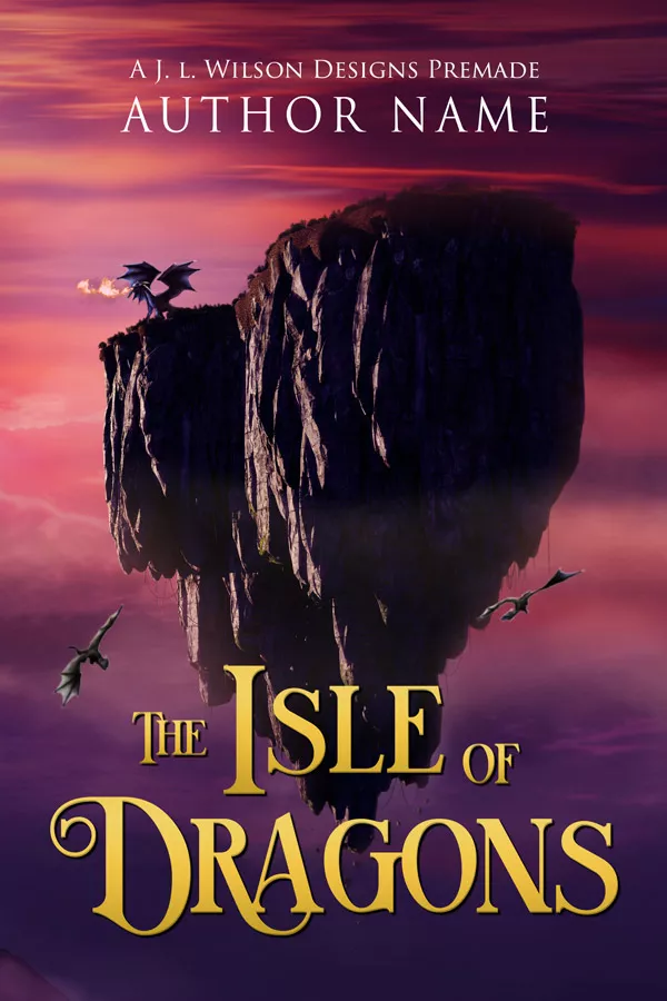
You can tell these have vastly different moods at just a glance, though creating it involves understanding a lot about color schemes, saturation, gesture and body language, facial expressions, silhouettes, typography, and more.
So if this seems like a lot, well, you’re not alone. It is a lot. There’s a reason the most successful authors purchase covers created by professional designers. It’s a lot to keep track of, especially since subgenre expectations are always changing, and you have to express the correct tone and mood within those expectations. not surprisingly, it takes a lot of time to learn to do this at a professional level.
Luckily, if you can scrape together some money, you don’t have to create them. You just need to be able to recognize them well enough to know your designer did a good job on your custom cover (or if you’re on a tight budget, the premade you’re purchasing – Yes, you may not get the greatest cover at the lowest price range, but it will likely do a better job than any DIY cover you’ll create without any design experience and you can take the time you saved to write more books to earn more income to get better covers in the future).
Ok, so I need the cover to match the (sub)genre, heat level, and tone of my book if I want it to sell. But how do I know what books in my (sub)genre look like?
Good question. I’m writing an article on that as we speak. But for now, look through other books like the one you’re writing, and take note of what images are on their covers. Look through goodreads top lists in your genre. Use keywords that match your book to search pinterest for other cover images. Analyze Amazon bestsellers in the categories you want your book to rank in.
Professional Typography
Typography is probably the most underrated and overlooked skill when it comes to cover typography, but great typography can save a cover with mediocre art, while mediocre typography can ruin a book cover with gorgeous art. I see it happen time and time again with authors creating their own covers, and even with a lot of decent designers.
I know, it feels a bit unfair, and yet, that’s the world of books. Words, and the way they’re presented, are important.
If budget is forcing you to go the DIY route, Trajan Pro 3 is a free classic font for commercial use that works well for high fantasy book covers. There’s also Morpheus, Orpheus, Cinzel, and L’elf du mal to name a few other fantasy ones.
There’s actually a really wonderful resource for fantasy fonts my friend KD over at Storywrappers put together. Just be aware that while the ones at the bottom of the list are free, the ones earlier in the list cost enough that you’d probably be better off hiring a designer and just having them use the expensive font they already likely own.
As for what makes typography look good, I have a whole article devoted to professional typography. Check it out for specifics. Here, I’ll just note that professional typography matches the right genre (e.g. a high fantasy font and text style for a high fantasy book), doesn’t clash with the art behind it, and has good contrast so that it’s easy to read.
Marketable thumbnails
While it’s not overlooked quite as often as typography, many authors (and even designers) forget just how important a book’s thumbnail is. After all, the vast majority of all readers decide whether to even read an indie book’s description based solely on the tiny book thumbnail they see scrolling through amazon.
If yours doesn’t stand out and immediately tell the reader ‘this is my kind of book’, your writing never even gets a chance to convince them.
So if you’re ever making a design decision for your cover, err on the side of having a strong, marketable thumbnail.
What exactly does that mean?
Well, if you shrink the cover image down to about an inch tall, are the main elements on your cover still discernible?
Does your spaceship stand out from the planet or moon behind it? What about the castle on your fantasy novel? Is the silhouette easy to see against the sky backdrop? Or does it fade into the mountain behind it?
If your cover has a strong thumbnail, it will be easy to tell what the most important images on the cover are, even when the cover is small. This is true for any cover, whether it’s character-based, symbol-based, or location-based.
If your symbol cover has a crown, rose thorns, and a crow on it, those elements should be easy to make out in its thumbnail. If the focus of the cover is a girl with a bow and arrow, her upper body and the bow and arrow should be clear, even when the cover is the size it shows on retailers.
If a cover has a marketable thumbnail, then those images combined together will immediately signal the right subgenre, tone, and heat level that we’ve already discussed, and the typography won’t fight with the art behind it for attention.
A designer creates a strong thumbnail by ensuring that the important elements have clear silhouettes. And this is done through a variety of design techniques (e.g. simplifying dark and light values, contrast, controlling color saturation and edges, composition)
If you’re ever unsure if a thumbnail is strong, shrink it down and turn it black and white. If you can still clearly tell what the most important elements are, you’ve probably got a strong thumbnail.


Want more detail? I wrote an article entirely about book cover thumbnails. That’s how important they are. Check it out.
Hopefully, you now have a better idea of what makes a book cover successful. Now comes the hard part. Getting those words on a page, so you can put this new knowledge into action. 😉
Want to learn more about sci-fi and fantasy book covers?
Sign up to my e-mail list here. In addition to getting early access to new premade covers before anyone else and periodic exclusive discounts, you’ll also get concise, detailed information about what makes a book cover good at its job and how to ensure the book cover you get is one that will put your book into the hands of the right readers.
Or check out my sci-fi and fantasy book covers and read more articles about book cover design.