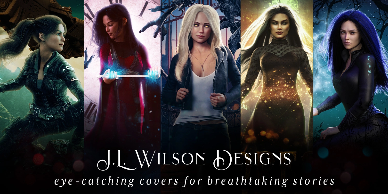
Book covers are about Marketing with a capital M. That means, it doesn’t matter if those premade book covers are the most gorgeous things you’ve ever seen. If they don’t fit your stories, they’re wrong for your books.
Now that may seem like common sense, but there is a surprising amount of nuance between subgenres that can be invisible to an author who isn’t as familiar with the market. For example, maybe the premade you’ve found has the hair color and the wings and the magic exactly the way you imagined your angel character. That means it matches, right?
Well, not necessarily.
If you’re writing a YA high fantasy story about an angel mage which has little to no romantic subplot and the premade book cover is designed to meet adult angel fantasy romance conventions, that’s the wrong cover for you. The readers most likely to pick it up will not only be looking for a major romantic plot, but likely a bit of sexual heat as well.
Which means that beautiful cover that could have done an amazing job for an adult fantasy angel romance has now set your book up to have a lot of disappointed readers, many of whom may unfortunately go on to say as much in your book reviews.
Ok, fine, so I should pay attention to how steamy the cover is. Easy. Can we get back to ogling the pretty covers now?
Not quite. 😉 Read on to see what else you should check before grabbing that premade cover, and what issues you can safely ignore.
I listed this first because if the premade’s subgenre is wrong for your book, nothing else matters. Don’t buy the premade. If you’re not sure how to tell if it’s the right subgenre for your book, study other books with similar stories to yours and start making lists of what their covers have in common.
What kind of title treatments are they using? What kinds of color schemes? What are some common main elements on the cover? How much of the cover do characters take up? The list goes on and on, but if you study these “lookalike” books, you will learn to spot the design trends that make up your subgenre. Until you can do that, you are much more likely to buy a premade that doesn’t fit your book.
For example, each of these covers signals angel, but none of them target the same subgenre.
Halo is targeting young adult (YA) fantasy readers. Archangel’s Legion is targeting urban fantasy (UF). A Deadly Sin is targeting Paranormal Romance (PNR). Angelfall is targeting Post-Apocalyptic (PA) Fantasy and How I Minister with Angels is targeting Religious/Spiritual.
You can see something similar with the fantasy and sci-fi premades I’ve created over the years. While each of these covers has dragons on it, each is targeted at a different audience. The Isle of Dragons has a younger audience than Dragon Found or Dragon War. And while both Dragon Found and Dragon found can be described as targeting epic fantasy, they each have different audiences in mind, with Dragon War showing a more traditional male-centered gritty epic fantasy, and Dragon found suggesting more female-centered YA epic fantasy.
So trust me. Just having the right symbol or having a character look “right” isn’t enough. If the designer’s done a good job, their premade book covers will be designed to target a specific subgenre and therefore a specific reader audience, and you need to make sure whichever cover you’re ogling is targeting the right reader audience for your book.
Now I don’t want to pretend that none of these subgenres have anything in common or may not seem somewhat similar at times. Urban Fantasy and Paranormal Romance both take place in our world and involve supernatural elements, for instance.
Not all UF readers like PNR and not all PNR readers like UF though. Market your UF as a PNR and you may get reader complaints about the romance not taking up a large enough role in the story. Market your PNR as UF and you may find people leaving annoyed reviews at the sheer amount of romance in the story.
And that’s just the tip of the iceberg. Choose a premade cover that signals religion as your genre when you’re actually trying to sell YA fantasy, and the readers who love your book may never even see the cover.
So while I won’t pretend that there isn’t an element of arbitrariness to subgenre categories or that authors don’t mix and match and pull from several subgenres all the time, you still need to decide which subgenre is the main subgenre you want to market to, especially if you’re going the premade route. Designers typically create premades to match popular well-defined subgenres since these are the covers most likely to sell. While you might be able to get a cover targeting one main subgenre with a hint towards another as a custom, you won’t find something that specific that also matches your story with a premade.
Know the subgenre you want to target. Be able to recognize it. And don’t buy a premade that doesn’t match it.
High fantasy is not the same as urban fantasy, even if the character matches all the right details or your book has a short period of time in the real world before the characters go zipping off to their fantasy world. If the clothing or the background suggests a modern day world and your book takes place predominantly in the past or on an alternate world, the premade is a no-go.
Perhaps even more important are the cases where the setting isn’t necessarily wrong… It’s just somewhat… vague or maybe even misleading. If your book is historical fantasy or takes place in a future high-tech society, there may still be places that are low-tech or show beautiful majestic nature in those worlds.
But the cover isn’t meant to technically be true. It’s meant to showcase the premise and the promise of your book. If the reader sees a beautiful natural landscape complete with a waterfall without a hint of high-tech or a specific historical time period, they’re going to make the assumption that this is what the book is about.
Why?
Because book covers showcase the most fundamental aspects of a book’s premise, and you don’t hide or leave out such an important aspect of the book as its main setting. If you do, you’re likely to not find the readers who would love your book.
Note: I know this can make things tricky for some books, especially if you’re writing tropes that don’t go together as often. Angels in your post-apocalyptic world? I want to read it. But you’re unlikely to find that as a premade because angels are less common in that setting. (Even the Angelfall example above doesn’t scream PA in current PA cover trend terms since it’s been out a while.) So most of the angel premades you see aren’t going to work, and you may not have a choice but to purchase a custom cover in those cases.
If your book is all about the wonder, don’t go for something that has a dark edginess to it. It’ll just tell all those readers looking for wonder, that your book isn’t right for them and bring all the readers looking for dark romance or dark creepiness to your book’s door.
Both of these are YA fantasy with angels, but even at the barest of glances, you feel like you’re getting a very different story with each.
4. The amount of romance or heat level is wrong for your book.
Is romance or sexuality not a big part of your books? Don’t purchase premades with scantily clad characters on it (male or female). It usually tells a reader to expect some heat. I’d also recommend being very careful with purchasing a cover that has just 2 characters on it in a pose that might suggest a relationship since this is another prominent way to showcase romance as an important element of a story.
You can see an example of this with a premade and a custom cover I created. At a glance, you can already tell that Bound by the Alien Water Lord has a notable heat level where Plant Bound does not.
5. A fundamentally important aspect of the character is wrong for your book.
This is true regardless of whether that aspect refers to the species of character, the type of magic being used, or even the character’s portrayal as a warrior when they’re a skittish academic. This is something of a no-brainer, but I see it happen quite frequently nonetheless. Don’t put a little girl on your cover if your story is focused on a middle-age guy who barely interacts with children (even if there’s this one super important moment in the book with a little girl). Don’t hint at a prominent disability if your character isn’t disabled. Don’t suggest your character’s doing stunning lightning magic if he’s as magicless as a muggle.
Note: I’m not referring to details that are often superficial like hair color or eye color. Just the important details that might suggest to the reader that they’re going to be reading about someone vastly different than who they will actually be reading about.
Maybe the character has a watch on in the premade, but your character doesn’t ever wear one. Maybe she’s got a pencil in her pocket when that never occurs in the book. Or perhaps she’s got her long hair down in the premade, while your character usually wears it up or has short hair.
Those details don’t really play a role in how well the cover will market your book, and you’re safe to ignore them and buy those beautiful premade book covers as long as they fit in all the other ways I just mentioned.
Even if the hair or the eye color don’t match.
I know, I know. This one is always controversial with authors when I talk to them because the hair and eye color do matter to the author. After all, this is who you’ve been imagining through the long hours you spent writing it. And as a writer myself, I totally get it.
But as a designer, unless hair color or eye color is a major plot point, it makes basically no difference as to whether the cover attracts new readers to your book. They pick up a book based on whether the premise and subgenre of the book intrigues them, not the hair color. So if you’re on a super tight cover budget and a premade works in every other way, this can be a way to get a great professional cover at a discount. Besides, you can often change eye color for free in a premade or get a new cover down the line after this cover gets enough readers to find your book.
And yes, I know sometimes you can also change hair color for free, but I always recommend authors think very carefully before doing this. Most authors don’t realize just how big of a role the color palate of a book cover plays in the overall mood of the cover. It’s easy to assume that changing hair from black to red won’t affect anything, but it can really change the feel of the cover in some cases. And if that weren’t a big enough issue, changing from a dark color to a light color (or vice versa) can make something that looks stunning and clear at thumbnail size (the way most readers see your cover), suddenly difficult to separate from the background, such as when you change black hair to white with the woman’s head being positioned in front of a big white moon.
Lots of premades have random minor details in the background (e.g. crows on tombstones in a cemetery, cats on fences). If the detail is minor and not the focus of the cover and the detail doesn’t suggest the wrong subgenre, you’re probably safe to ignore it. Readers aren’t likely to assume that the main character has an important crow sidekick just because there happens to be a crow flying in the cemetery any more than they’re likely to assume those random crates in the alley are pivotally important to the book.
Readers are good at telling the difference between random details that are there to set the mood or the scene and details that are unusual enough to always draw attention (like a zombie) or have had one or more design elements used to pull attention to them (e.g. the detail takes up a large amount of cover space, the detail is the only dark element on a light cover or vice versa, the character is looking at it). If that bird that was a minor detail on another cover is now placed prominently on this cover at a much larger size with the character staring at it while it’s a deep dark red against the white of a moon, the reader will assume that the bird may be important.
So most background details can be safely ignored, but if a detail takes up a chunk of the cover’s focus or is strange enough to draw attention, tread carefully. There’s a big difference between an average bird in a forest and a vampire rising from a grave. You can safely ignore the bird, but if there’s a vampire climbing out of a grave in the background of your cover, even if it’s not the main focus of the cover, your book had better have vampires play a role.
Fonts and text treatment are incredibly important cues for marketing, so I’m going to explain this carefully. You can safely buy a premade with a text treatment that doesn’t work for your subgenre as long as everything else fits and you double check that the text treatment can be changed to match your subgenre. This is usually a free change for premades.
Important caveat: Given how fundamentally important fonts and text treatment are to subgenre and marketing, you’ll want to be sure that the designer can do the text treatment you’re looking for before you purchase. You can check this by scrolling through their website’s portfolio to find examples where they’ve done a title treatment that matches what’s being done in your subgenre (e.g. white, silver or gold metallic serif font text treatments for high fantasy).
If you see good versions of these types of title treatments, then you’re probably safe to purchase it. Just double check that you’re right about the premade cover art itself fitting your subgenre. A designer regularly using title treatments that don’t match the cover’s subgenre can be a sign that they may be missing other things as well, and the cover may not be as good a match as you think. Alternatively, if you’re not as well-versed in the market, you may discover that the whole premade itself is actually signaling a different subgenre than you thought and not just the title treatment.
Lastly, if you’re looking at a premade from one of the top designers in the business, it’s worth knowing that every now and then, those designers do sometimes purposely go against a title treatment trend. If everything about a cover screams urban fantasy (which is what happens with the best designers), then they can sometimes use a title treatment that goes against trend for a specific purposeful effect. These can be stunning covers, so it helps to keep in mind that if you’re buying a premade from one of the best designers in the industry, they probably had a reason for what they did. If the cover is in the right subgenre and fits your book, you’re probably just fine.
Sign up to my e-mail list here. In addition to getting early access to new premade covers before anyone else and periodic exclusive discounts, you’ll also get concise, detailed information about what makes a book cover good at its job and how to ensure the book cover you get is one that will put your book into the hands of the right readers.
Or check out my sci-fi and fantasy book covers and read more articles about book cover design.
Authors write brilliantly-complex, nuanced stories every day. They take life and somehow distill it down into these wonderful book-size adventures just waiting to be picked up by the right reader and lived in for a bit. It’s magical. And any writer can tell you just how firmly stories can get tangled around your heart, especially when the story is one you yourself have written.
This is what makes it especially hard for an author to step away from all the beautiful complexities they so carefully wove into their story, and consider the book the way it needs to be considered to design a cover that will do its one and only job: Get the right readers to pick up the book.
Because nothing matters about your cover, not how beautiful it is, not how much it cost, not how perfectly it details your characters or how much you love it, if nobody picks it up. Or worse, if only the wrong readers pick it up. (Ever wonder where some of those 1 star reviews come from? Put a “clean romance cover” on a steamy romance or a hard sci-fi cover on a sci-fi romance and you’ll find out quickly.)
To a certain extent, this is why writing back cover copy is so difficult for authors too. Because covers and back cover copy are marketing. There’s no room for complex nuance, for mentioning all the subplots you carefully threaded in, or for adding the many little, subtle things that make your story so… well, wonderful.
And that’s ok.
Your cover only gets about 3 seconds of a reader’s attention, before they’ll move onto the cover after it if your cover doesn’t make them click for more. Just 3 seconds. That’s not enough time to convey all that beautiful complexity. That’s not even enough to convey a tiny slice of it.
But it is enough time to showcase your book’s PROMISE. And that’s all it needs to do.
By promise, I mean the genre, the tone or the “feel” of the book, and maybe a rough idea of the main character and the setting, all wrapped up in one giant gut feeling hint to the reader about the kind of book this will be.
And that’s all your cover needs to do before it passes the reader on to your back cover copy to finish the job of convincing the reader this is a book they HAVE to read.
So how do we do this? How do we convince your ideal readers that this book cover is showcasing just the book they’re in the mood for?
We do what we should always do when we’re trying to communicate a message: We make sure the message is as clear and professionally-delivered as we can.
For a book cover, that means learning your subgenre’s language (i.e. the design elements that usually appear on a cover in that subgenre). And you learn this by studying other bestselling covers in your subgenre because you want to see what’s working.
And so much more.
If it sounds like a lot, that’s because it is. It takes time to learn a new language, and the language of each subgenre is no different. The good news is that it takes far less time to learn to recognize a language than it does to produce it. And if you’re hiring someone to create your cover for you, you only need to recognize it. (Technically, if you’re hiring the RIGHT person to create your cover, you would only need to identify your book’s subgenre and then force yourself to leave what they create alone. That said, it can be hard to know the right person to hire if you can’t recognize the language of your subgenre, and I personally always recommend making informed decisions, so I always recommend at least learning to recognize covers that match your subgenre.)
This sadly is where most authors mess up. They don’t learn the conventions of their subgenre, or they do and they ignore them. When you do this, you can end up with some absolutely beautiful art. Beautiful art that tells all your ideal high fantasy readers that your book isn’t high fantasy at all. Maybe the cover has enough symbols that suggest it’s urban fantasy or steampunk or epic fantasy. Maybe your urban fantasy comes off as the wrong type of urban fantasy (which is a completely different reader audience). Or worse, maybe nobody can actually tell which subgenre it belongs to.
Trust me. You ignore genre conventions and the language of your genre at your own peril. Readers are busy people, and they’re not studying book covers when they browse, they’re scanning. Quickly. Some subconscious part of them knows what type of book they’re in the mood for and is looking for something that looks like it. If your book doesn’t look enough like the other books in its subgenre, your ideal readers will scan right over it and keep scanning until they find one that does.
I promise, you’ll have a chance to show your readers how unique your book is from the others in the subgenre they’ve read. But first you have to show them how it’s the same.
Your book can’t stand out as a brilliant book if it never fits in enough to get picked up and read by readers who would like it in the first place.
If you found this helpful, make sure to check out the busy indie author’s guide to book covers where I discuss genre matching in more detail and discuss the other two fundamentals a book cover needs to be successful.
Want to learn more? Sign up to my e-mail list here. In addition to getting early access to new premade covers before anyone else and periodic exclusive discounts, you’ll also get concise, detailed information about what makes a book cover good at its job and how to ensure the book cover you get is one that will put your book into the hands of the right readers.
For questions, please contact me here. Social media messages aren’t as reliable for getting quick answers.