What exactly is a book cover thumbnail you ask?
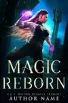
Well, this is a thumbnail.

And so is this.
Thumbnails are what we call the size of a cover when it’s shrunk down to a much smaller size like these two here, and I’d argue it’s one of the most fundamentally important aspects of book cover design, even if it’s commonly overlooked by most authors and even some cover designers.
If cover thumbnails are so important, why would anyone overlook them?
Well, authors usually see a premade cover in larger sizes when they’re shopping for covers online and designers work on covers at larger sizes to create them. It’s surprisingly easy to overlook the thumbnail, especially since most indie cover designers are self-taught and thumbnails, for all their importance, aren’t actually mentioned that often.
Most readers, on the other hand, will only see covers at the size of a thumbnail when they’re browsing online book stores.
And because readers rarely see covers at larger sizes when they’re shopping, how clearly a cover reads in thumbnail is actually one of the most important aspects to examine when you’re looking at buying a premade book cover or considering a custom design. It doesn’t matter how beautiful the cover is (and trust me there are some absolutely spectacular ones out there) if a reader can’t tell immediately tell from a thumbnail what’s actually on the cover.Remember, readers are scrolling past dozens of books in a very short period of time. If the thumbnail isn’t clear, it can’t grab their attention long enough to make them pause. Even if the cover is breathtakingly beautiful when you zoom in, the reader will never see that.
What makes a reader scroll past a book cover thumbnail?
Honestly, this question has a lot of answers. The genre’s not clear. There’s not enough contrast to distinguish the different elements on the cover. The elements on the cover don’t grab their attention. The cover itself doesn’t look professionally put together. I could keep going.
But for the purposes of this article, we’ll talk about the one that’s most relevant to making a cover read clearly in thumbnail.
And that’s: Values.
The light parts of the cover versus the dark parts.
Because of the ways our eyes work, they quickly distinguish light and dark (what artists call values) before they ever take into account color. So what does this mean for your cover?
Well, you can have a shiny green dragon flying in front of a majestic stone castle on a cover that practically screams epic high fantasy. But if the dragon is a dark shade of green and the castle is a dark shade of gray, our eyes will have have a hard time distinguishing that there are two different shapes. They’ll just see shades of ‘dark’.
This is true with the larger version of the cover, but it’s much more blatant and obvious the moment you shrink the cover to thumbnail. When this happens, the shape of the two objects can blur together and the outline/silhouette can get completely lost. If you’re lucky, the dragon shape is fully within the outline of the castle, so you only lose the dragon in thumbnail. Reader sees a castle and maybe pauses since castles are good symbols to suggest high fantasy.
If you’re less lucky, the outline of the dragon partially overlaps the castle, and the two together create a unidentifiable silhouette where it’s not clear what’s on the cover at all, and the reader scrolls past it.
So when you’re examining thumbnails, you want to first identify what is the primary focus of the cover. What elements are on the cover that are the most important for a reader to see in order for them to be able to tell this is a book they might want to read?
Whatever that is, it needs to read clearly.
If you have a character wielding a sword on the cover, and the sword gets lost in the shape of the character’s body… that’s a thumbnail issue. If the magic is a beautiful light purple color that blends a little too much into the light smoke of the background, that’s a thumbnail issue.
Will readers pick up book covers with thumbnail issues?
It depends on how much of the cover reads clearly. If the magic a character is wielding gets lost in thumbnail, but there are magical swirls all around the cover, the reader may still get the subgenre message and pick it up. But it won’t be because of the magic that blended into the background.
But this cover is beautiful. Surely, it has a great thumbnail.
Sadly, the two don’t always go hand in hand. Yes, more experienced designers produce spectacular art and the more experience a designer has the more likely they are to understand the importance of thumbnails and create clear ones.
Buuut…. there are a lot of skills you have to master to create a stunning cover and even more you have to master to create clear thumbnails. Designers master each of those skills at different times.
I always recommend authors make informed decisions about their covers. They’re just too important a part of your marketing not to, given how much time and energy and passion you put into your books. So rather than taking it for granted that the art will look great in thumbnail, just check it yourself.
Turn the screen size way down on your computer when you’re browsing through premades. Pay attention to how clearly subgenre jumps out at the small size and how easy it is to make out what’s happening on the cover. No, you won’t be able to tell everything that’s going on. But the main focus of the cover, whether that’s a character’s face, a character posed with a sword/doing magic, some sort of magical object/sci-fi tech or a landscape, you should be able to tell what it is.
Black and white is your friend
If you’re really having trouble, screencap the image and look at it in black and white. Since the values of a cover are what make the biggest difference in our ability to distinguish elements on a cover at thumbnail, looking at it this way can help you get past the confusion of color and better see how it will read at that much smaller size.
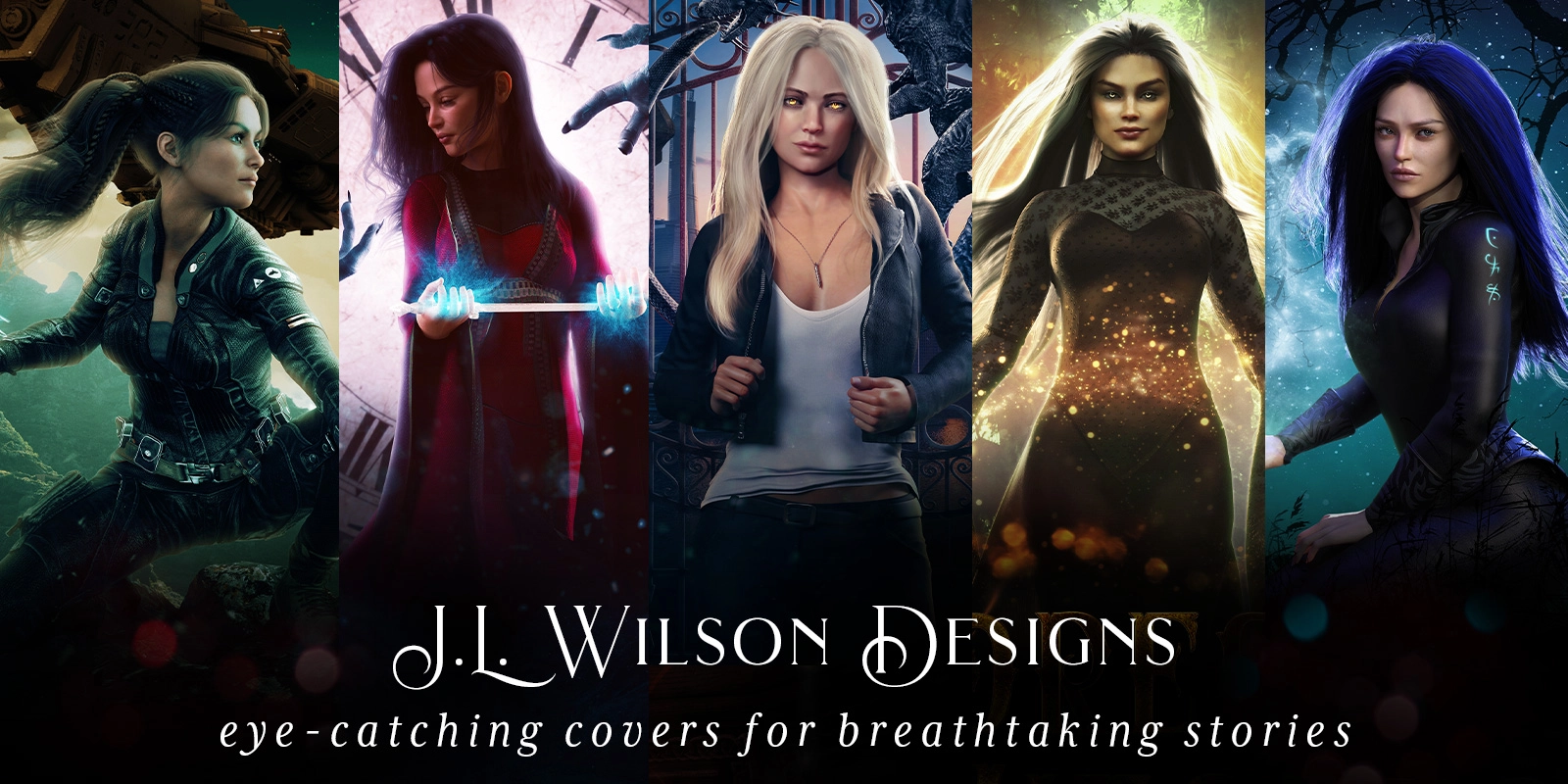
While designers should use colors to create contrast and direct attention across a cover (the way I used the pink accent color in Magic Reborn to draw attention to the magic), the most important parts of a design should be clear even in black and white.


So here are two quick examples of what clear thumbnails look like in black and white. In the first Magic Reborn example, it should be immediately obvious that there’s a woman in an action pose on the cover in front of some stone ruin archways holding something glowing in her hand. In the Lost Magic cover, it should be clear that there is a woman wearing modern clothes wielding magic in front of city buildings.
Ok, so the thumbnail isn’t… perfect. But surely the amazing art will make up for it?
This is one of those issues that sneaks up on authors (and even some designers) when they focus too much on the art over the marketing. Yes, you want the art to be stunning. But if you have a choice between stunning art with a muddy thumbnail that doesn’t read well and mediocre art with a clear thumbnail… sadly, the mediocre art will get more readers to pause their scrolling.
I know it sounds odd, but trust me. At the sizes of most thumbnails, it’s actually surprisingly difficult to tell what’s mediocre art and what’s stunning if the thumbnail reads clearly. You have to zoom in more to really see how great the art is, and even when a reader clicks to go to the book’s sales page, the cover image isn’t actually that big.
And while yes, you may share your cover with your current readers at nice large sizes so they can appreciate its beauty, covers aren’t really for your current readers. If your current readers like your stories, they’ll read your next book regardless of the cover. Covers are for new readers, the ones who don’t know that they’d love you yet. And they’re more likely to first encounter your work in the also-boughts of similar authors or in your advertising efforts, all of which…. lean heavily on thumbnails.
Honestly, if I had to list the two most important things that make or break a book cover, I’d list a) having a clear thumbnail and b) having professional typography. I’ve already talked about what makes typography appear professional with my email list (you can sign up here to read the article), and hopefully this article has helped you see the importance of a clear thumbnail.
So don’t be afraid to let go of the idea that art is the be all end all of cover design. You can have great art and great marketing. There are a lot of great designers that can give you both. But if you have to pick one, either because of time or budget, go with the marketing. You can use the money you earn from your book sales, to purchase great art later. 😉
Want to learn more? Sign up to my e-mail list here. In addition to getting early access to new premade covers before anyone else and periodic exclusive discounts, you’ll also get concise, detailed information about what makes a book cover good at its job and how to ensure the book cover you get is one that will put your book into the hands of the right readers.